Both Parties Got More Votes This Year, That’s a Challenge for Visualizing Results

Both Parties Got More Votes This Year: That’s a Challenge for Visualizing Results
Often, visualizations about election data focus on the margin of victory (the gap between a winner and loser) and share (what percent of the electorate a candidate captured).
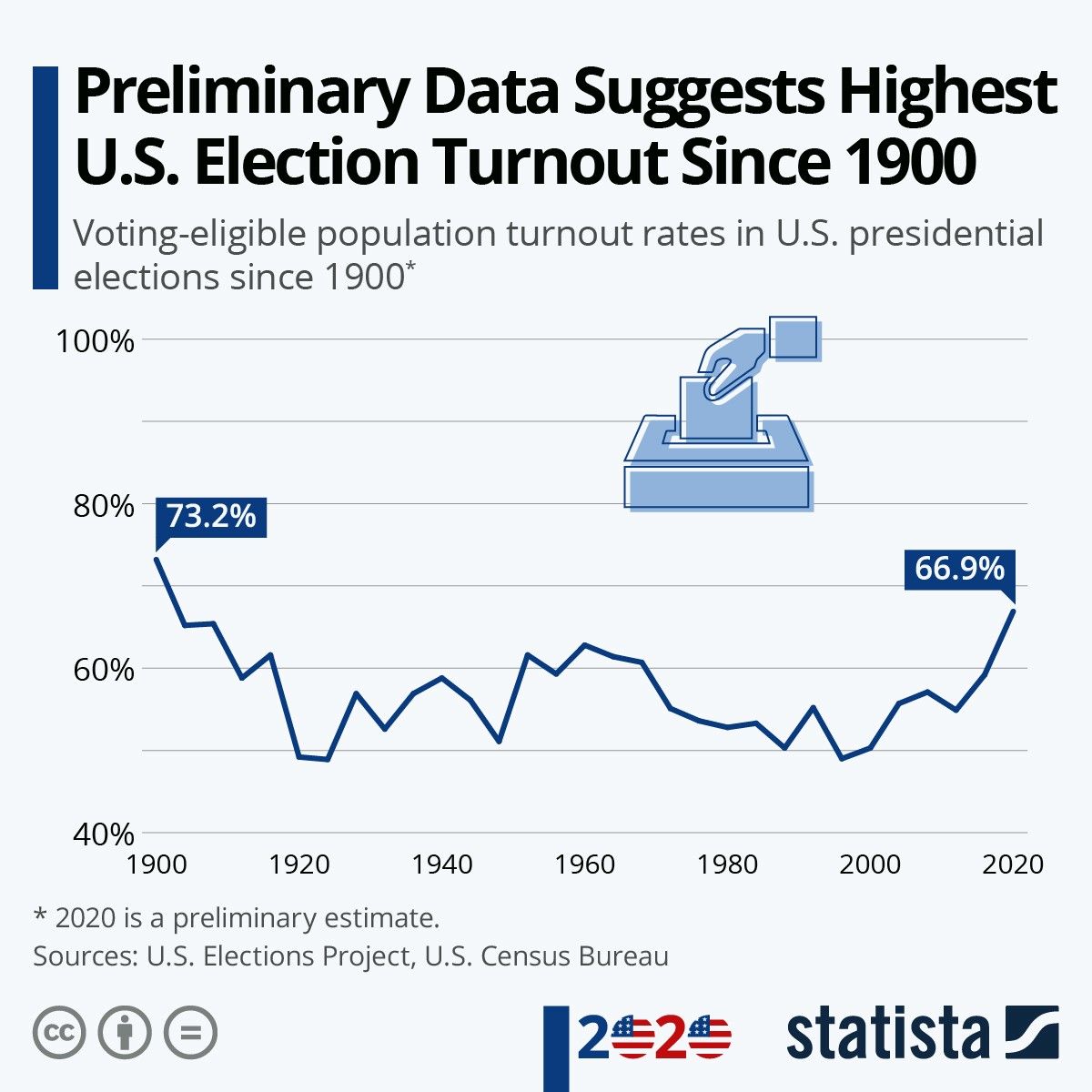
But 2020 was a very high turnout election. And such elections create some quirks in how we visualize election results.
For instance, many popular maps focus on changes to vote margin. So a red area is one where Republicans improved on their margin and a blue area is one where Democrats improved on their margin. But that focus on change can obscure who actually won in each of these counties. For instance, if Democrats win a county by 70% in 2016 but by only 60% in 2020, it shows up red on such maps, even if each party ultimately turned out more voters in that county.
Historically, we would think about a shift in margin like that as being largely comprised of people switching their votes since it’s from a relatively stable pool of “regular” voters. But elections are a lot more complex than that anyway and this election, in particular, featured lots of new voters, too. We won’t know the full story for many months as states update their voting records and analysts and political scientists are able to do more research.
The 2016-2020 swing is barely even worth mention on the 2012-2016 scale, at least outside of heavily Latino areas and ATL/DAL.
— Nate Cohn (@Nate_Cohn) November 21, 2020
If we narrow the scale to tease out this cycle's subtler shifts, suburban movement stands out a bit more but still isn't always overwhelming pic.twitter.com/TnseCxrhAl
Focusing on vote share can also be a little confusing. For instance, in Georgia, preliminary data suggests that all racial categories increased their turnout, but Black voters had a smaller *relative turnout increase* than white, Asian-American or Latino voters. (We get an early sense of this in Georgia since their voter registration form has a box people can check to identify their race / ethnicity.)
To put this another way, the “pie” of voters got bigger, including the “slice” of Black voters, but the “slice” of Black voters wound up being a smaller part of the (now very larger!) pie.
So, in this case, all of the following statements might be true if these preliminary analyses hold up:
- Black, white, Latino, Asian-American and “Other” voters all increased their turnout.
- Non-white voters had their highest share of the electorate ever (Black + Latino + Asian-American + other).
- Black voters had their lowest share of the electorate since 2006.
Naturally, organizations that mobilize Black voters in Georgia bristle at the 3rd message. And I don’t blame them! They worked hard to increase turnout. The fact that other groups of voters increased their turnout more shouldn’t (and doesn’t) diminish that work.
It’s also tempting for some Biden critics on the left to look at this data and say that he built a temporary coalition of white suburbanites and non-white base voters. But that’s misleading, too.
A more positive framing for these results is that a multi-racial, cross-class coalition of Democratic voters had a massive turnout surge that finally flipped Georgia blue. We’ll see how that holds up against more detailed analysis, but it’s just another way we should be cognizant of how particular analyses lend themselves to competing narratives in a year where Democrats + progressive organizations hustled hard to mobilize voters in the middle of a pandemic. (In the case of Georgia, there are also competing estimates of the racial composition of people who decline to identify their race on the voter registration form!)
Here are the electorate shares by year in GA, now including total vote history. Despite all of the hot takes about white turnout surges, it was the record-setting turnout from voters of color that delivered the state for Biden. pic.twitter.com/RpgYhpqSLZ
— Tom Bonier (@tbonier) November 18, 2020
Finally, I wanted to explore this a little bit in Tableau and produced a simple bar chart here that illustrates the increase in raw votes for each party’s presidential candidate by state from 2016 to 2020. It’s an extremely simple way of looking at the results, but in a high turnout year, maybe that’s a good thing to start with. It certainly makes sense to the organizer part of my brain, which is focused on maximizing turnout for a candidate.
To be explicit, what you’re seeing here is how many additional votes Joe Biden got in 2020 compared to Hillary Clinton in 2016 and how many additional votes Donald Trump got in 2020 compared to his first run in 2016.
A couple caveats here: we’re not done counting, so these margins will only increase. I’ve also removed New York from this analysis since they are so far behind in counting they are the only state where these numbers are negative! Static image below and an interactive version you can hover over (exciting!) on Tableau on clickthrough.
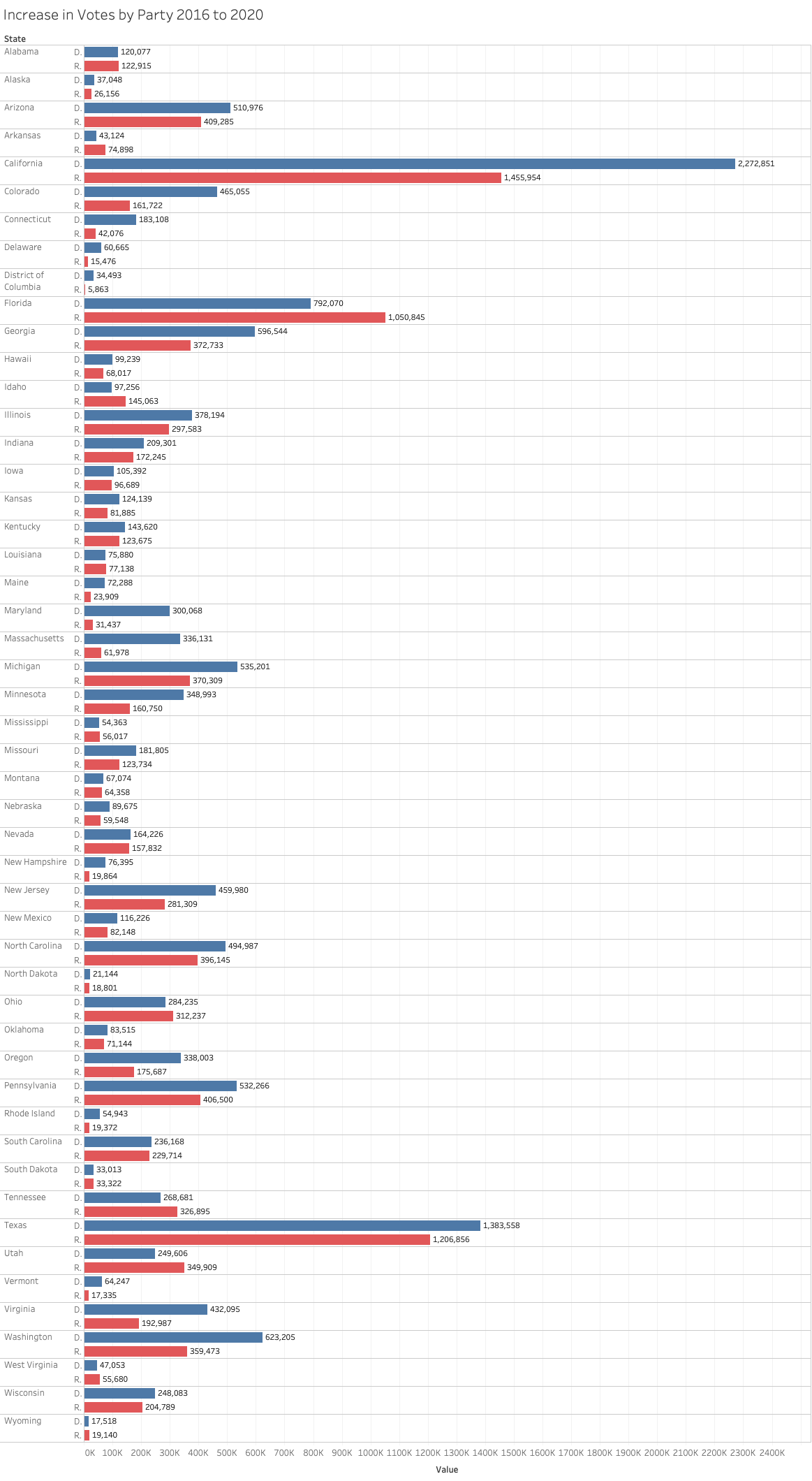
A few big trends:
- You can see the “Blue Wave” outperforming the “Red Undertow” in many states, particularly battlegrounds like Georgia, Michigan and Pennsylvania.
- The Blue Wave was even bigger in a lot of already-blue states, which helped Biden bolster his popular vote lead.
- A bigger Blue Wave wasn’t enough to make up the difference in some states like North Carolina and Texas.
- Republicans meaningfully over-performed Democrats by this metric in Florida and to a slightly lesser extent in Ohio.
Also if you’re wondering what these numbers look like nationally so far, Biden is at 79,975,985 and Trump is at 73,862,153. That means compared to 2016, there are about 14.1 million additional votes for the Democratic nominee and 10.8 million additional votes for the Republican nominee.
The data sources here are the Cook Political Report’s 2020 Popular Vote tracker and Daily Kos’s “Nerd Alert” spreadsheet of previous presidential elections. These data sets don‘t represent 3rd party voting the same way, so I want to noodle around a little bit on that, too, as well as accounting for “undervotes,” which were quite prevalent in 2016.